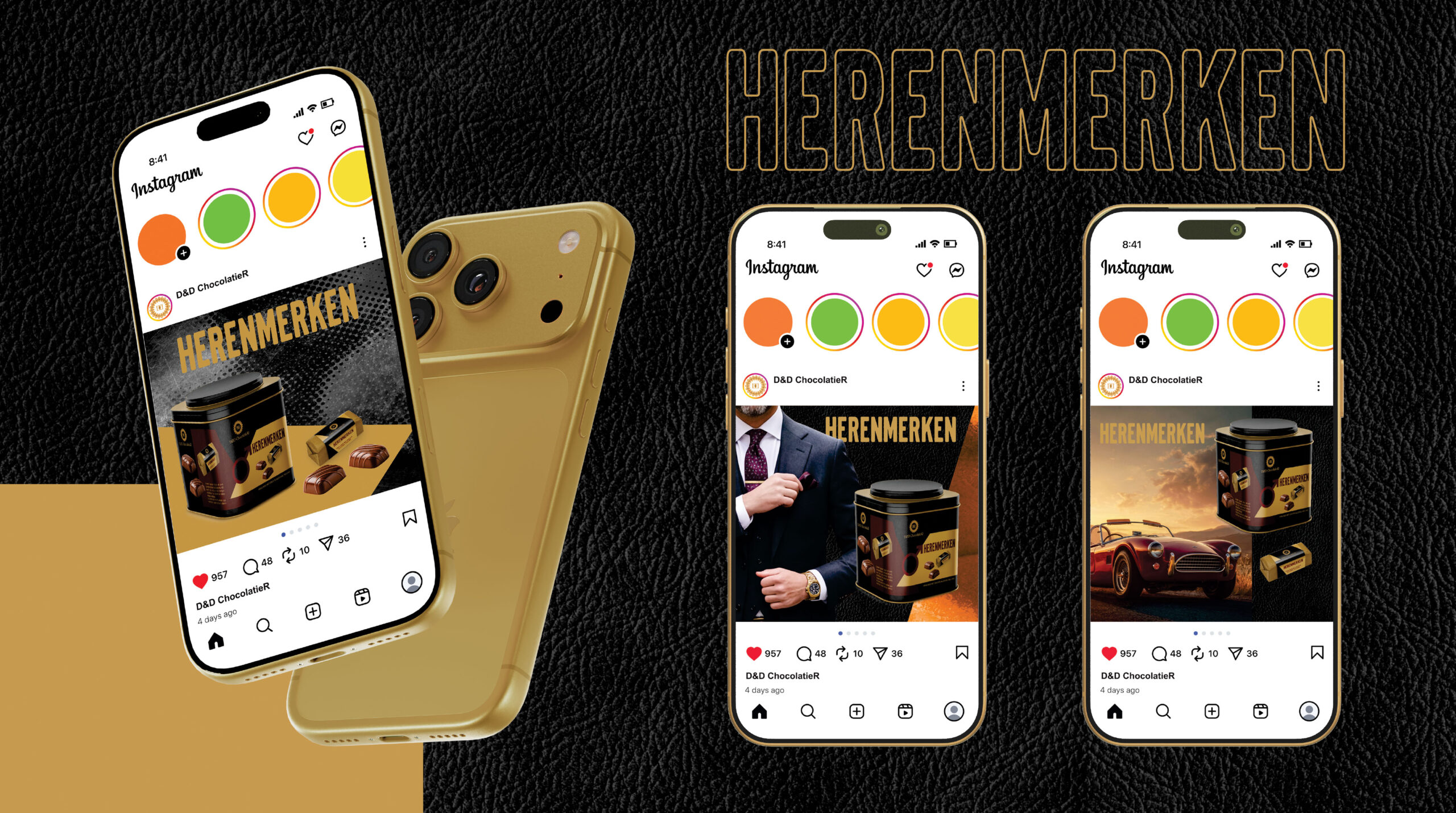
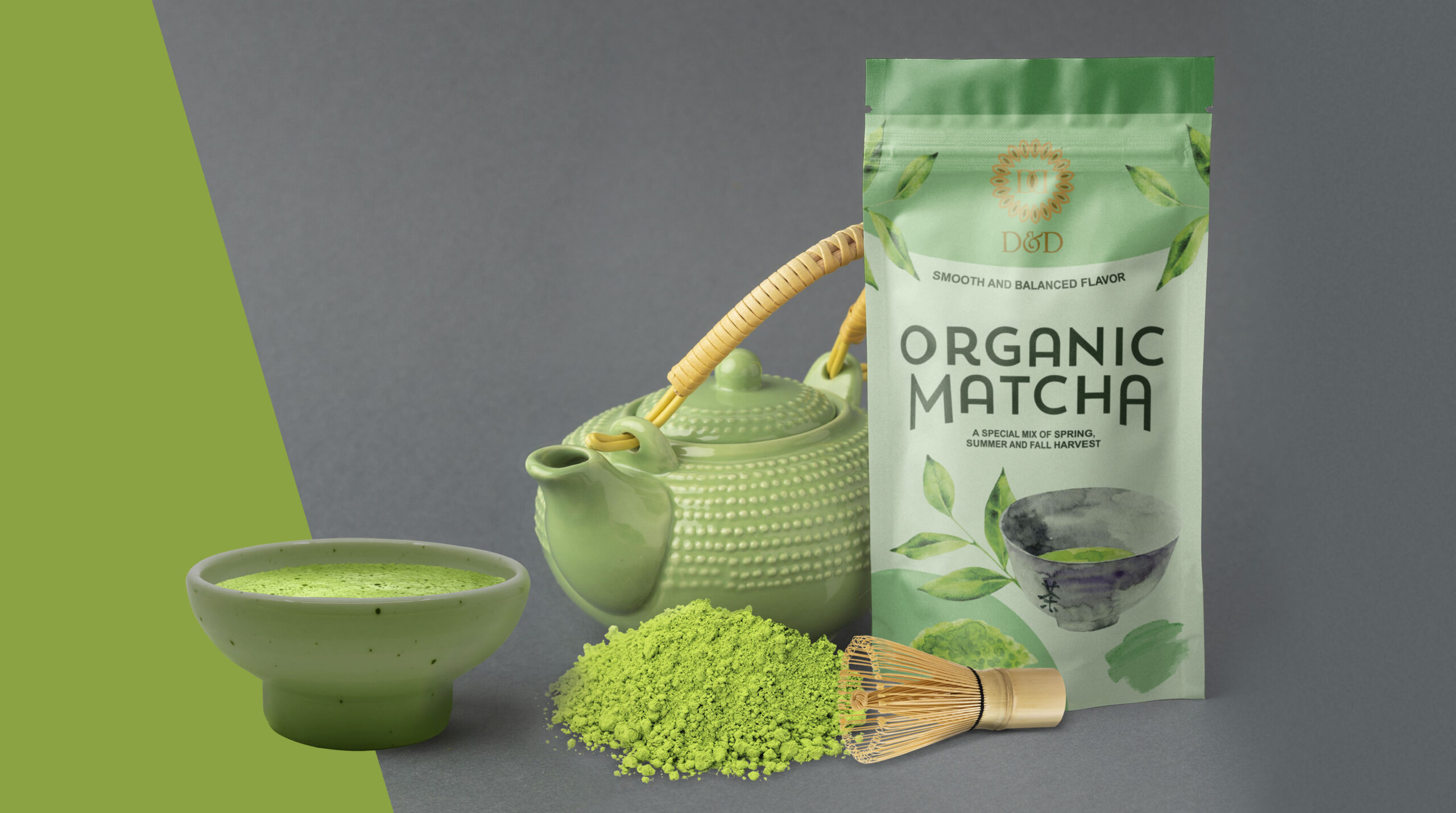
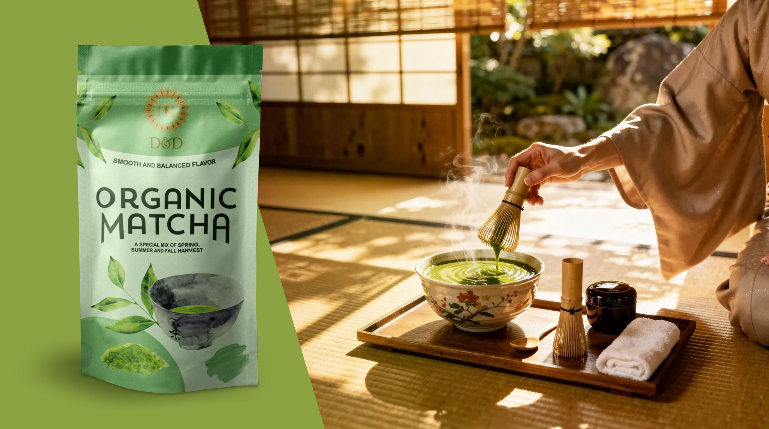
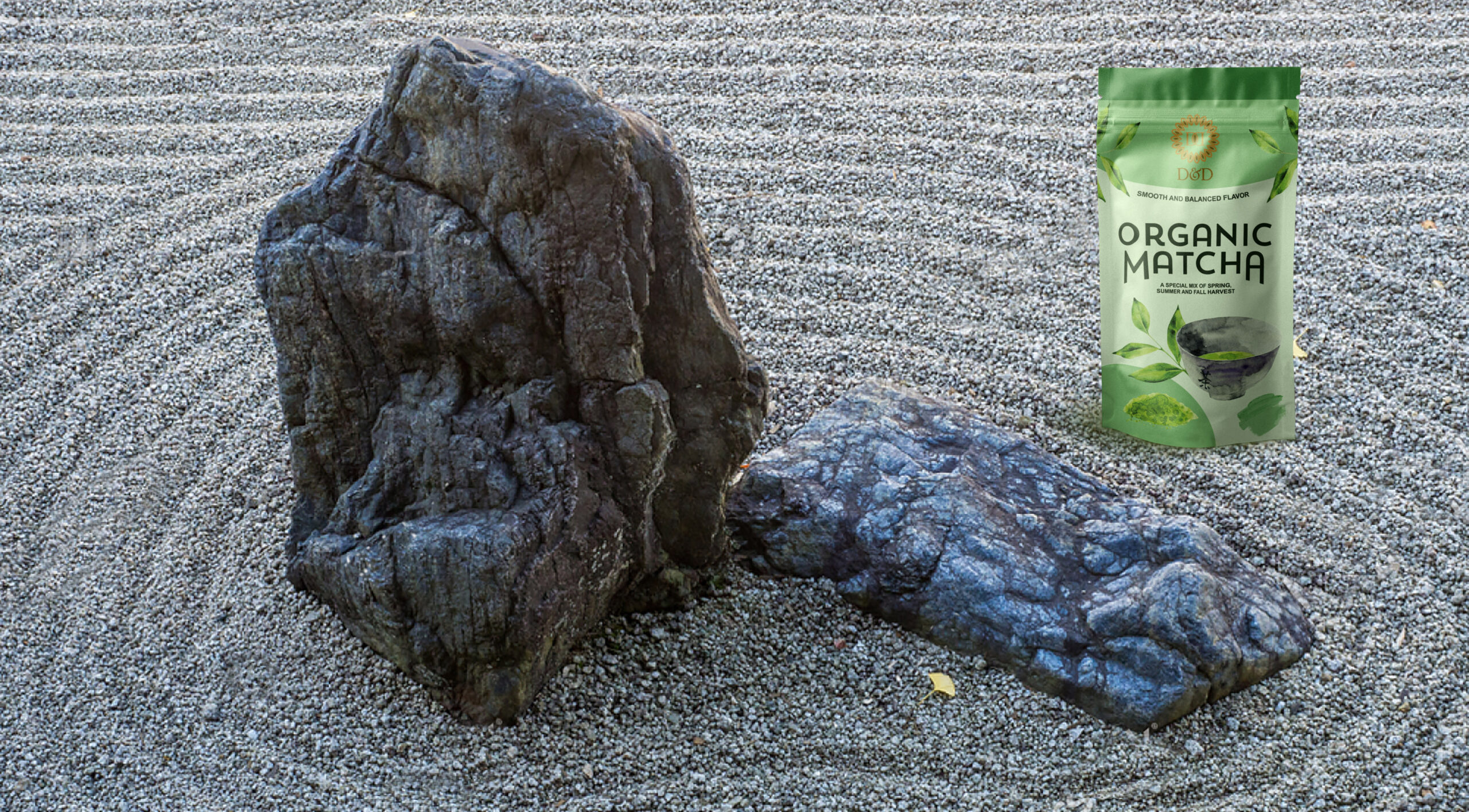
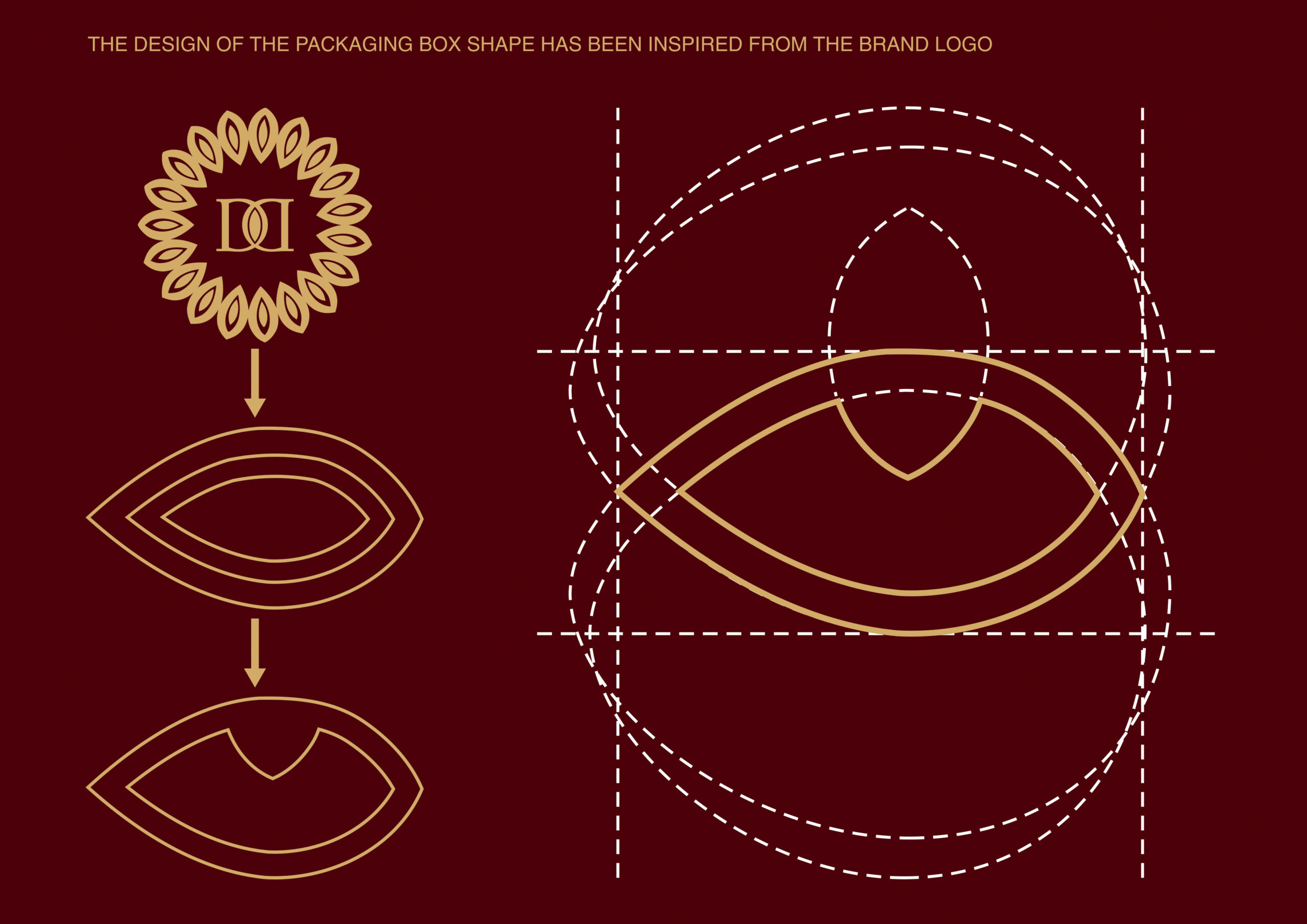
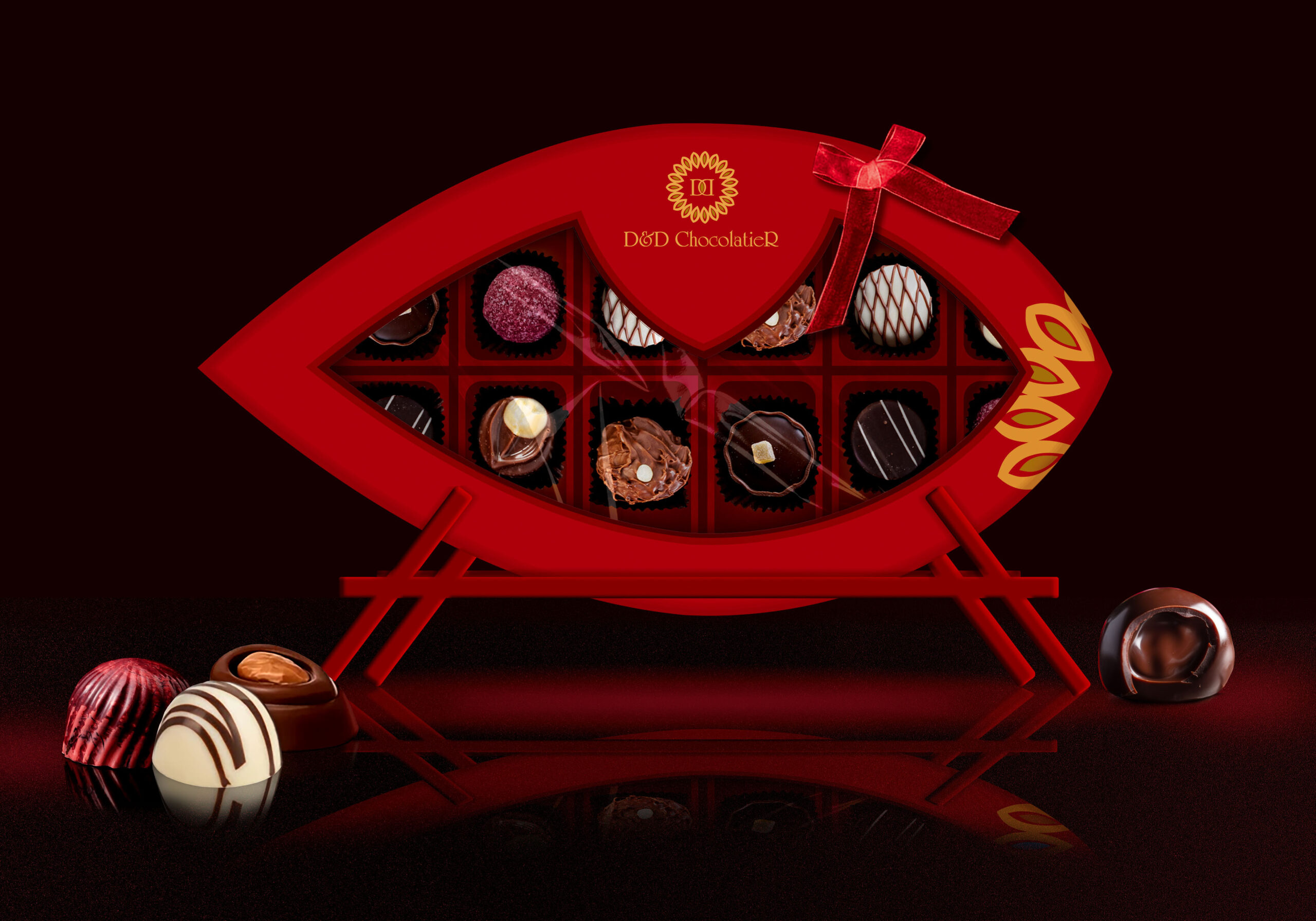
Concept design which can be adapted by request and become real for your own brand product
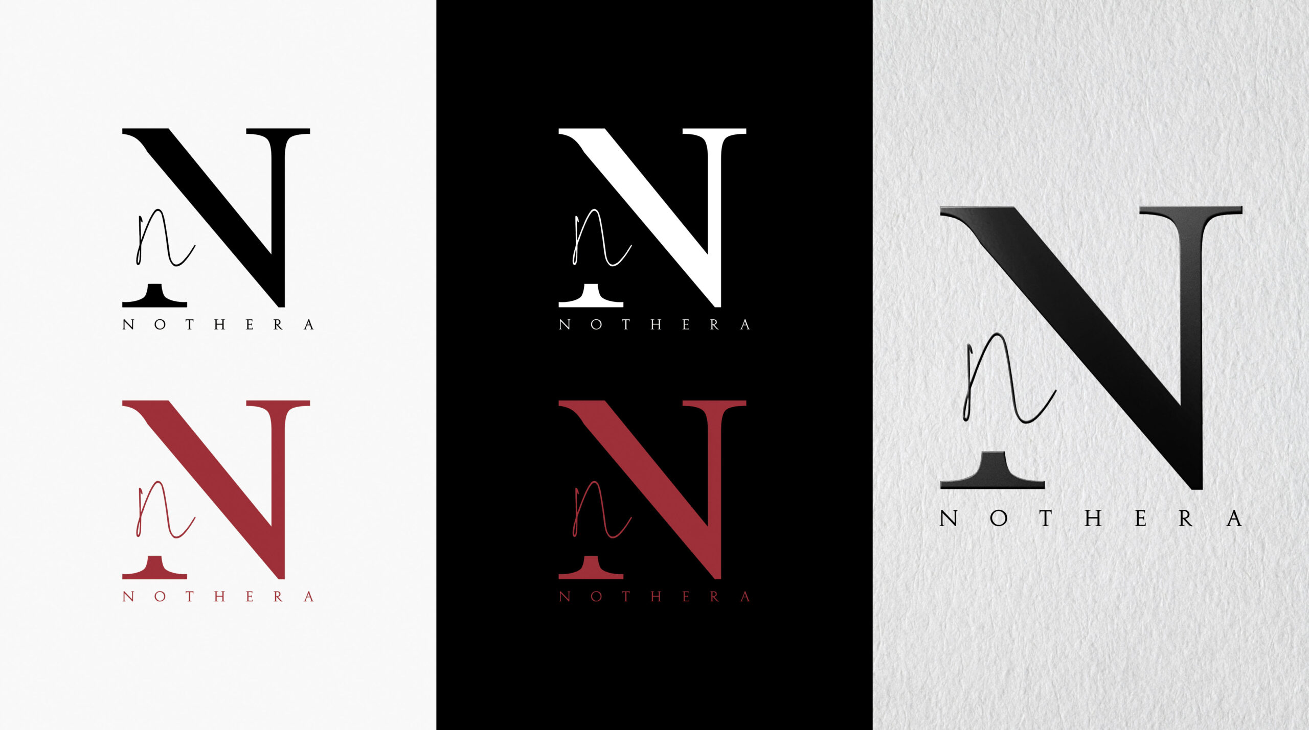
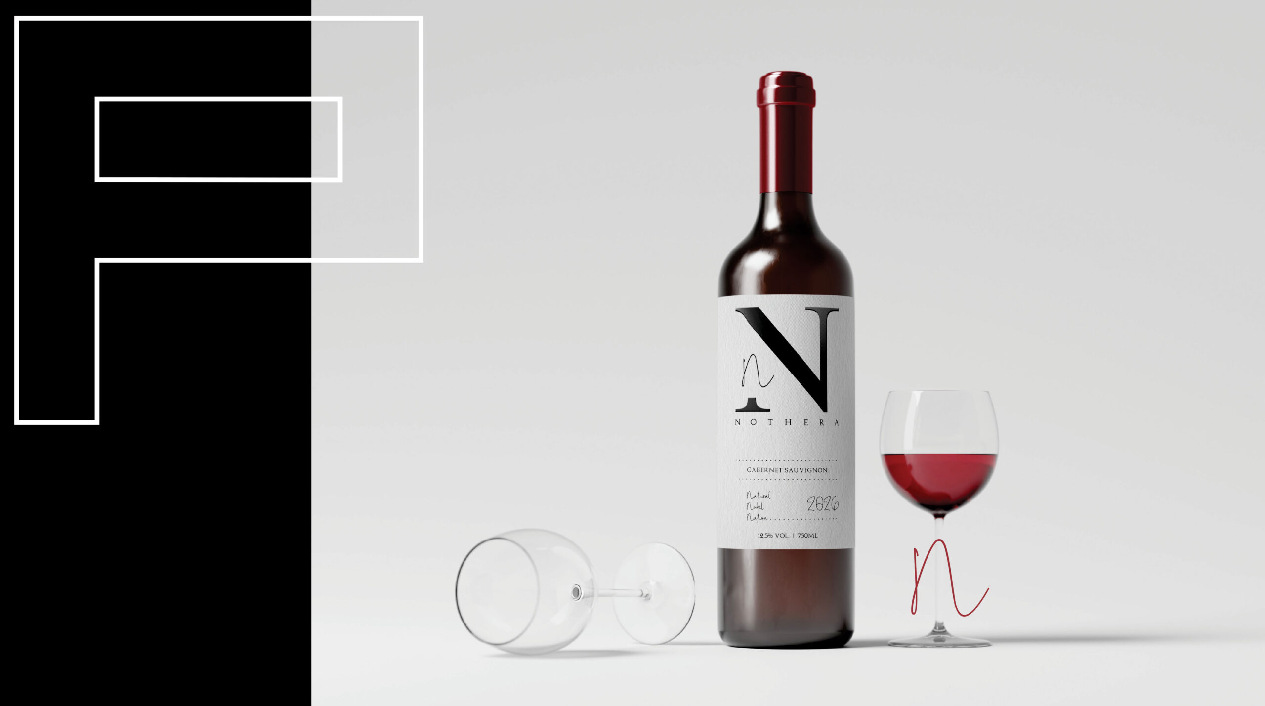
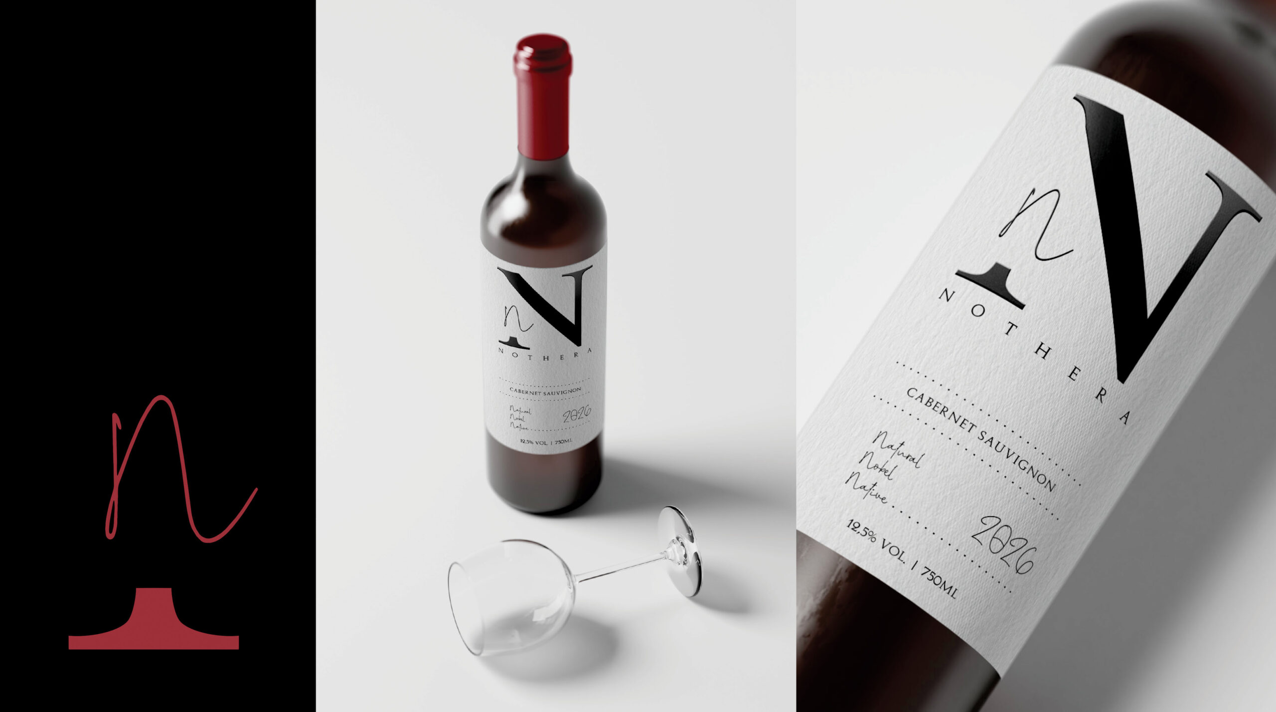
Graphic Design
As we can remark, sustainability is increasingly at the forefront of public awareness. Creating packaging that is suitable for the concept is not so easy, especially in fact that the term “sustainability” to not become only a jargon used to attract attention. So, an essential element in attracting attention to a sustainable packaging is choosing a simple, minimalist and visually attractive design that supports the concept of sustainability.
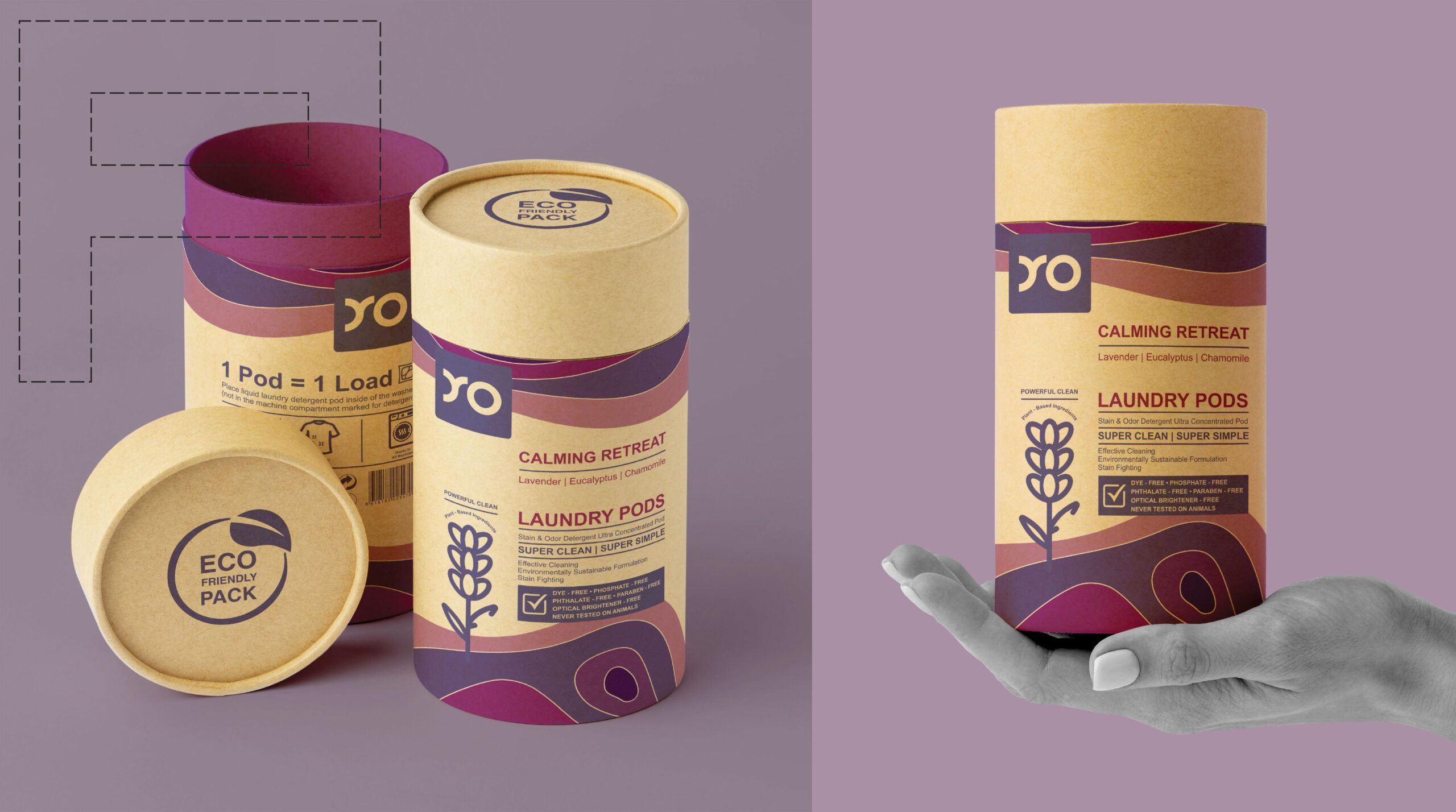
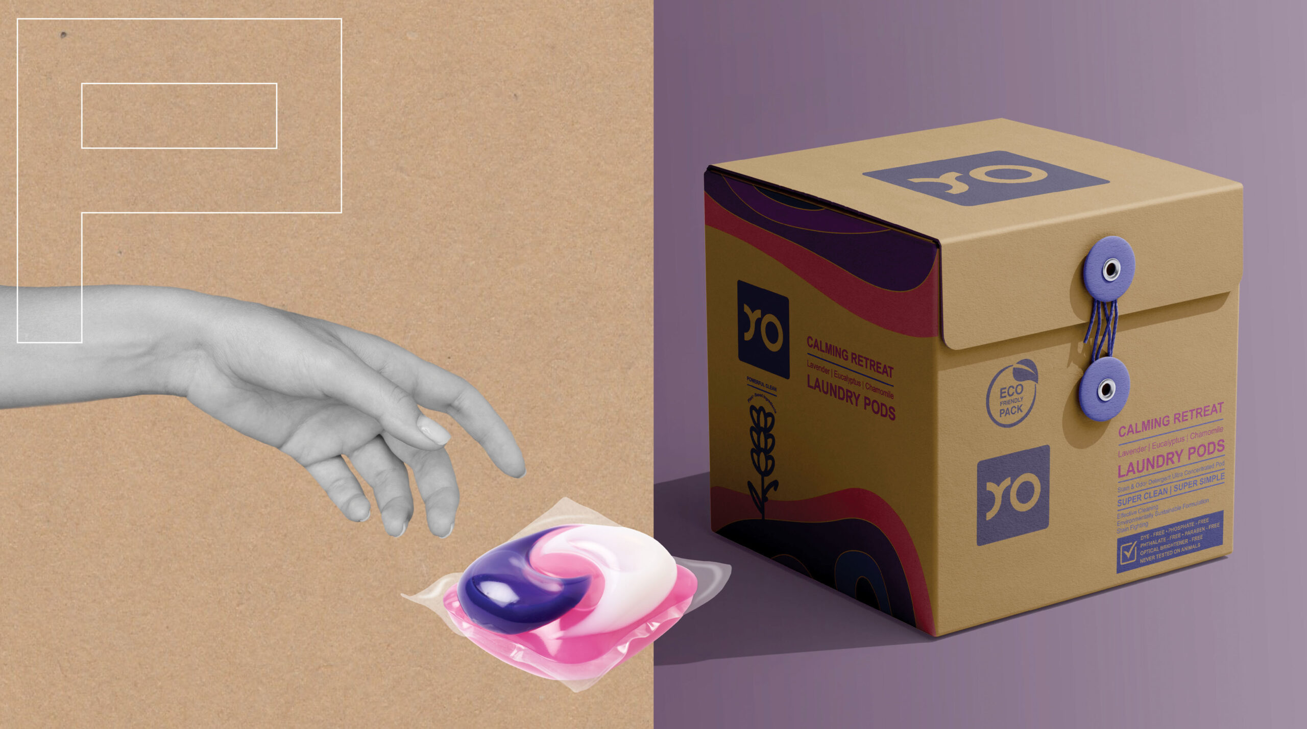
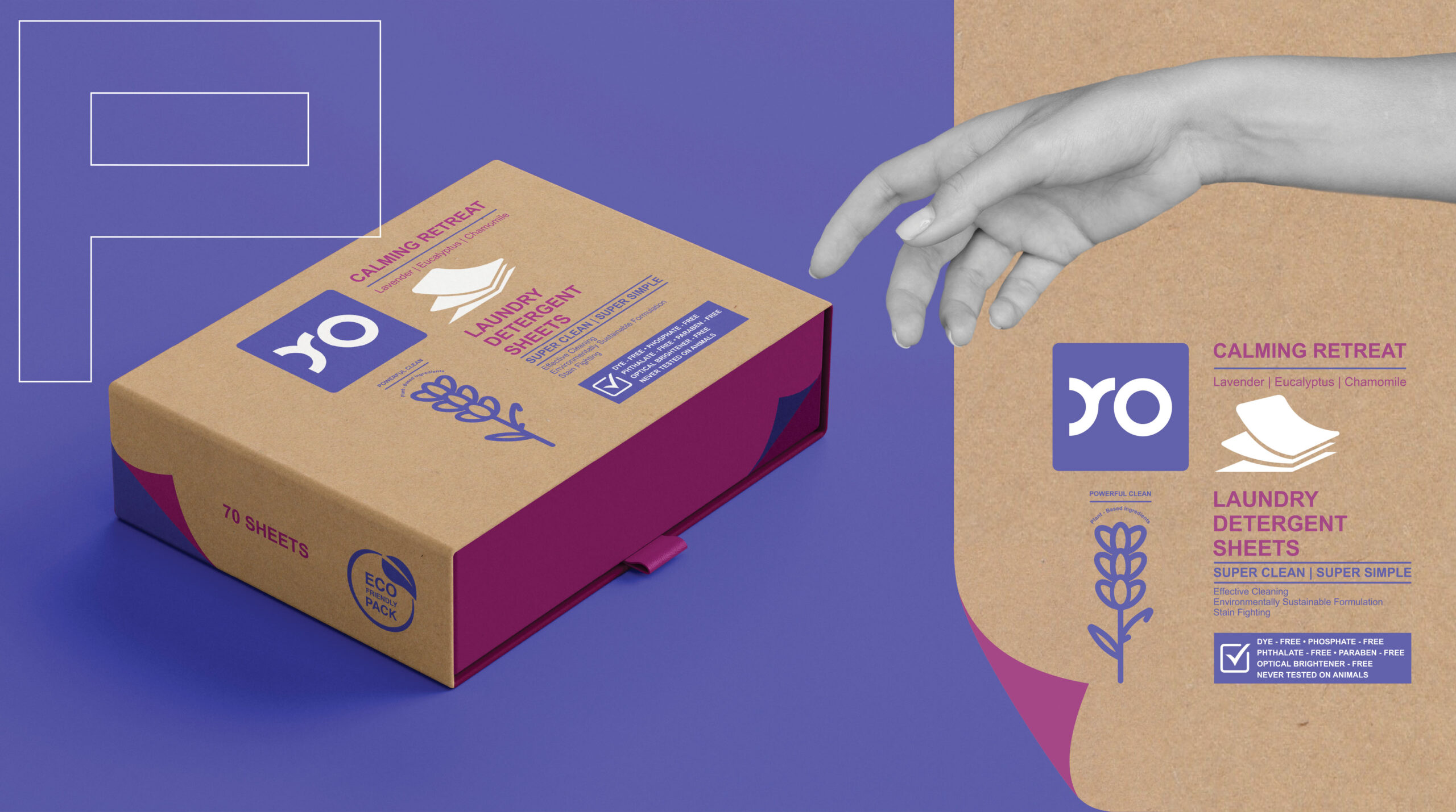
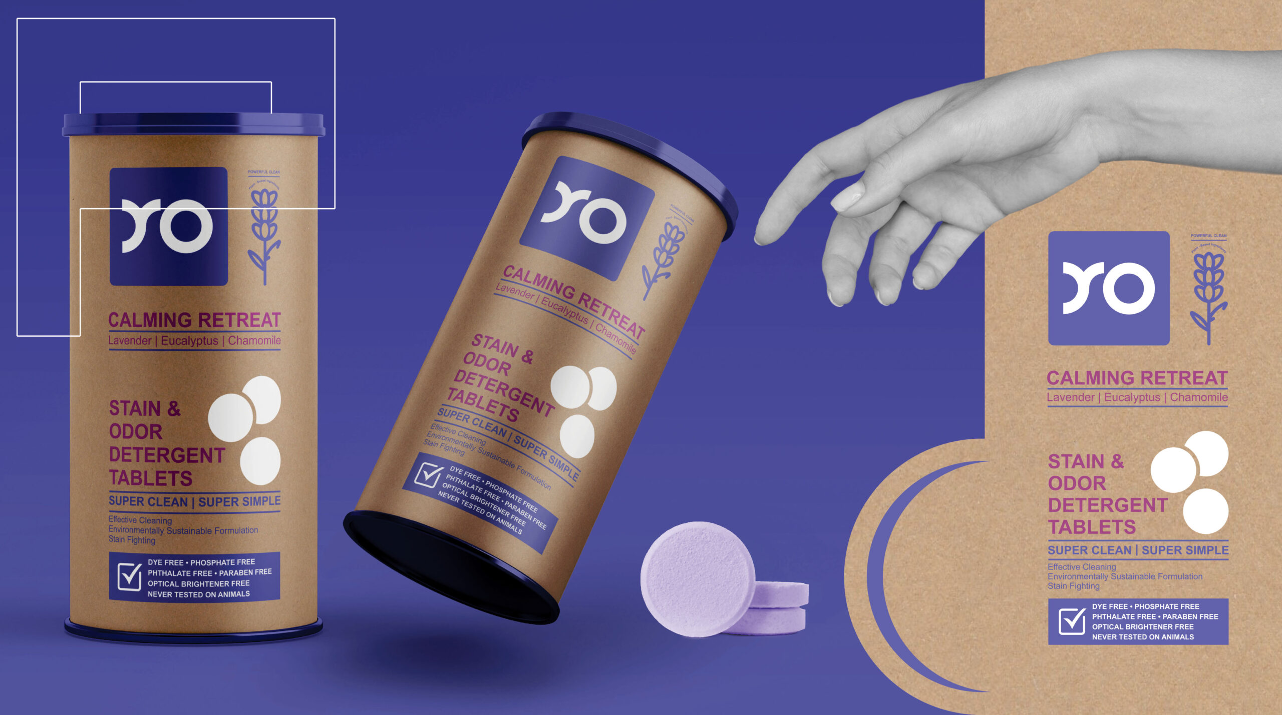
In the recent years, many of us have been wondering what makes a laundry detergent environmentally friendly? The “environmentally friendly” nature of a detergent depends on many factors, from how it is manufactured to how it is packaged. Now, more and more brands of laundry detergents and not only, have more sustainable packaging, whether they are completely plastic-free or made from recycled materials. Also, the manufacture of a more concentrated detergent is being considered, as it requires less packaging and saves the energy needed in shipping large volumes of products. Through these packaging concepts presented here, we have also tried to fit into the new visions regarding environmentally friendly packaging.
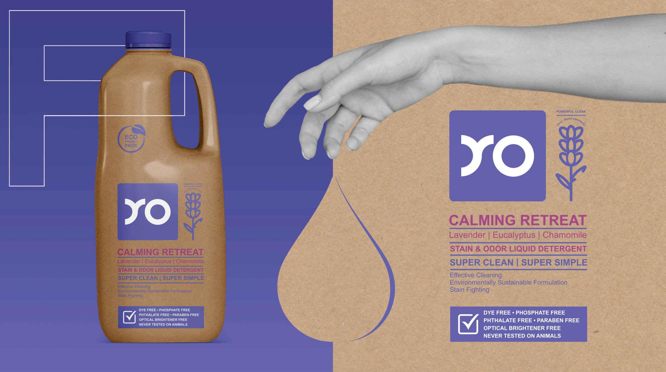
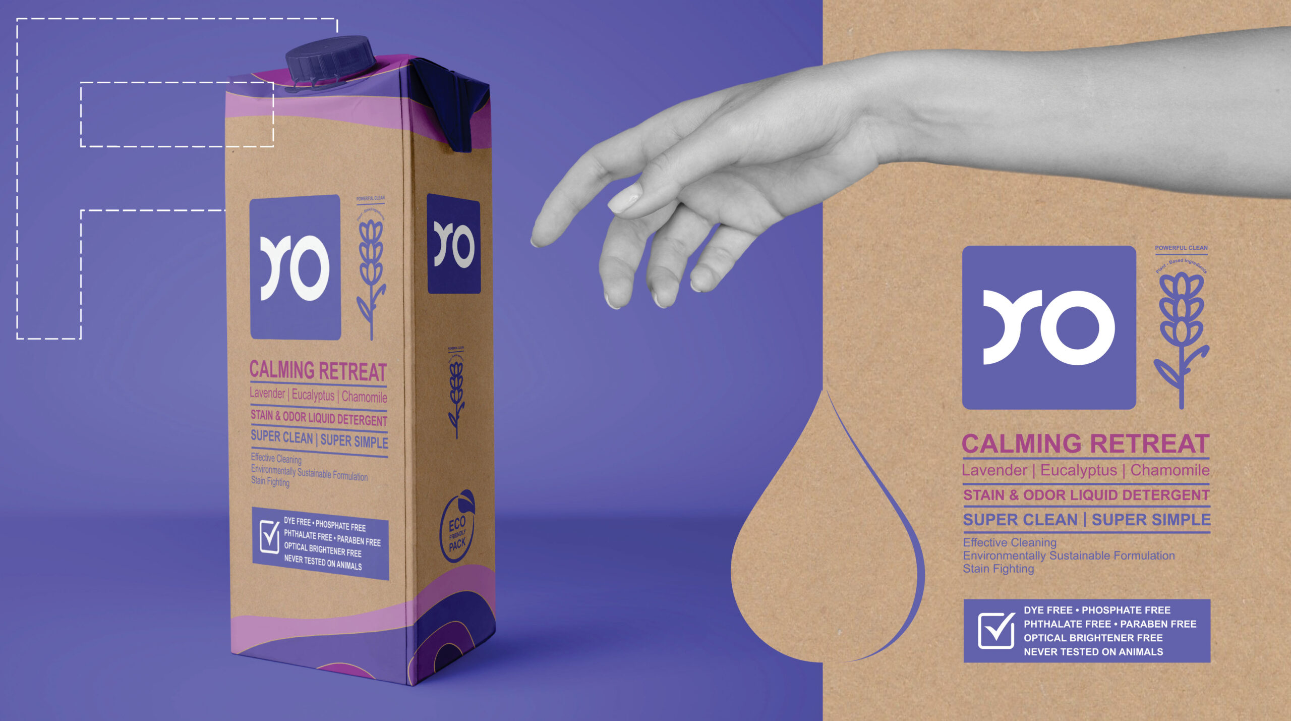
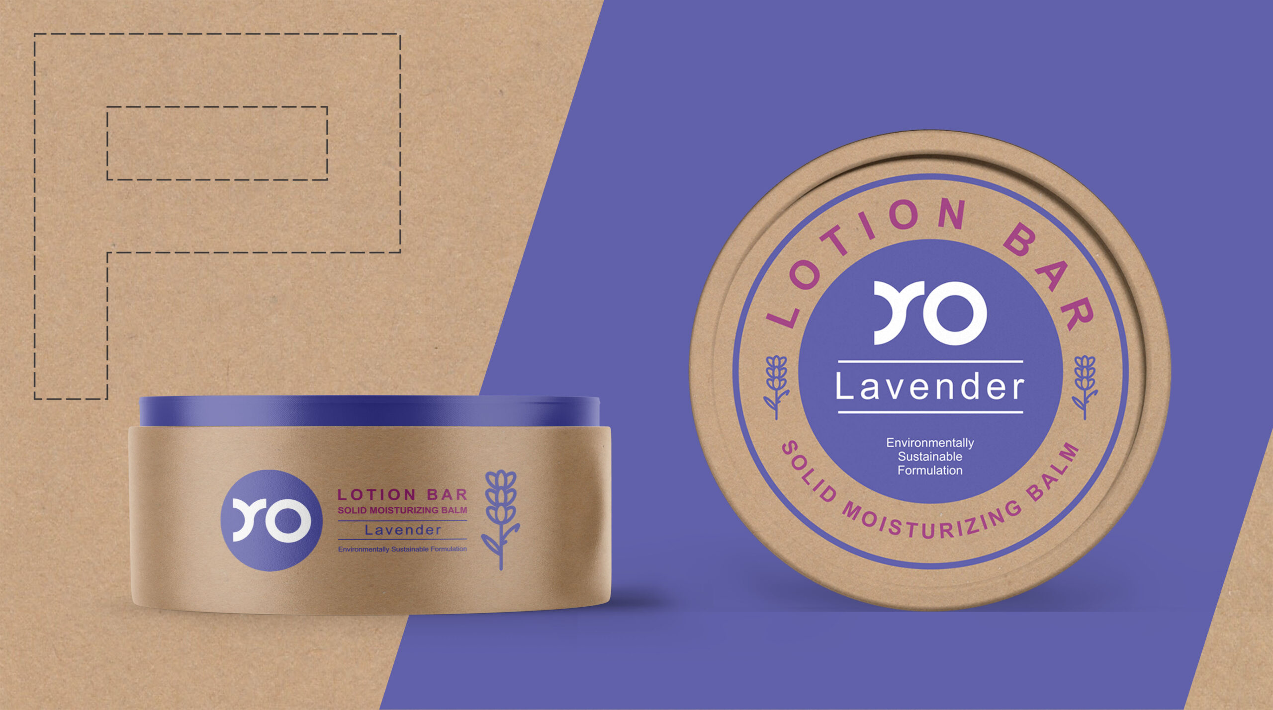
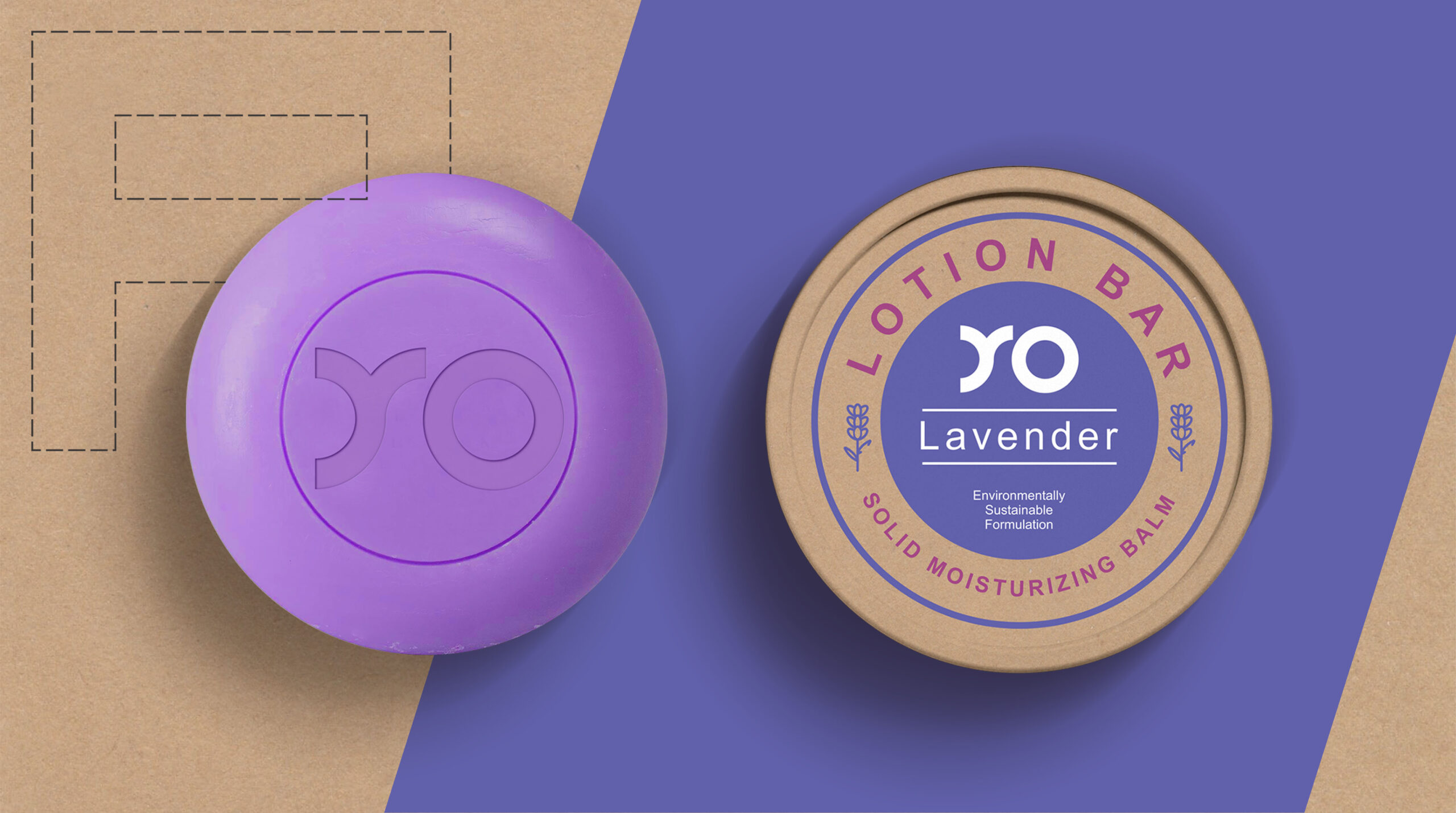
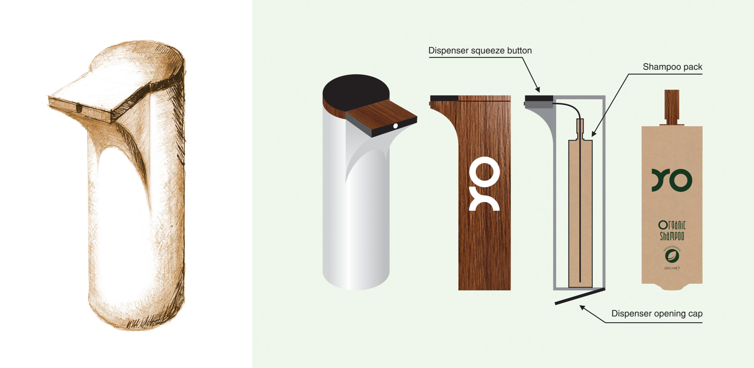
As more firms recognize a need for more sustainable alternatives to conventional plastic, many of them are making changes to packaging, doing things such as switching to regenerative, recyclable and compostable materials or reducing the number of different materials used to make recycle easier. But for some applications, the product and its regulatory requirements can severely limit the ability to make significant eco-forward packaging changes. Look no further than the personal care industry. But sustainable options can be limited when it comes to packaging liquid goods like shampoo, body soap, and laundry detergent, making plastic the most practical choice but which remains a real environmental nightmare.
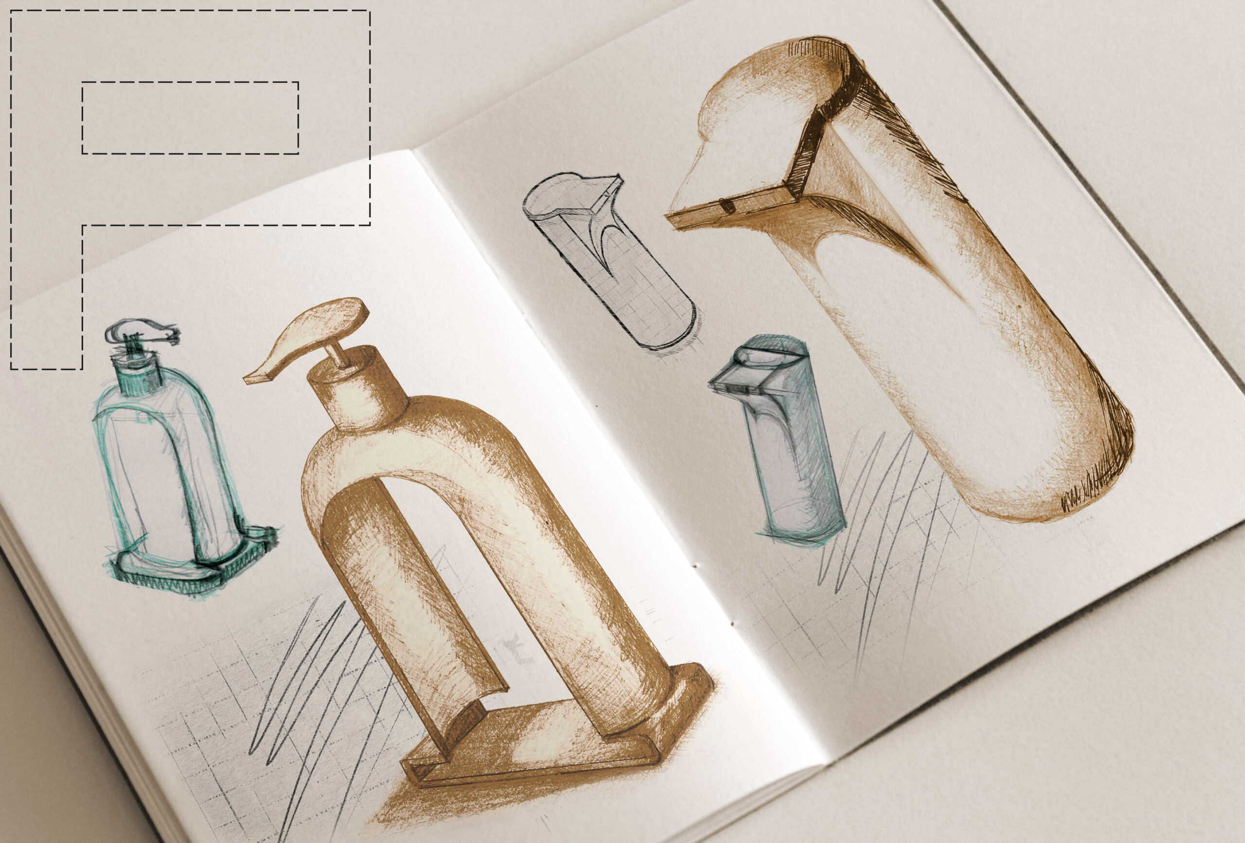
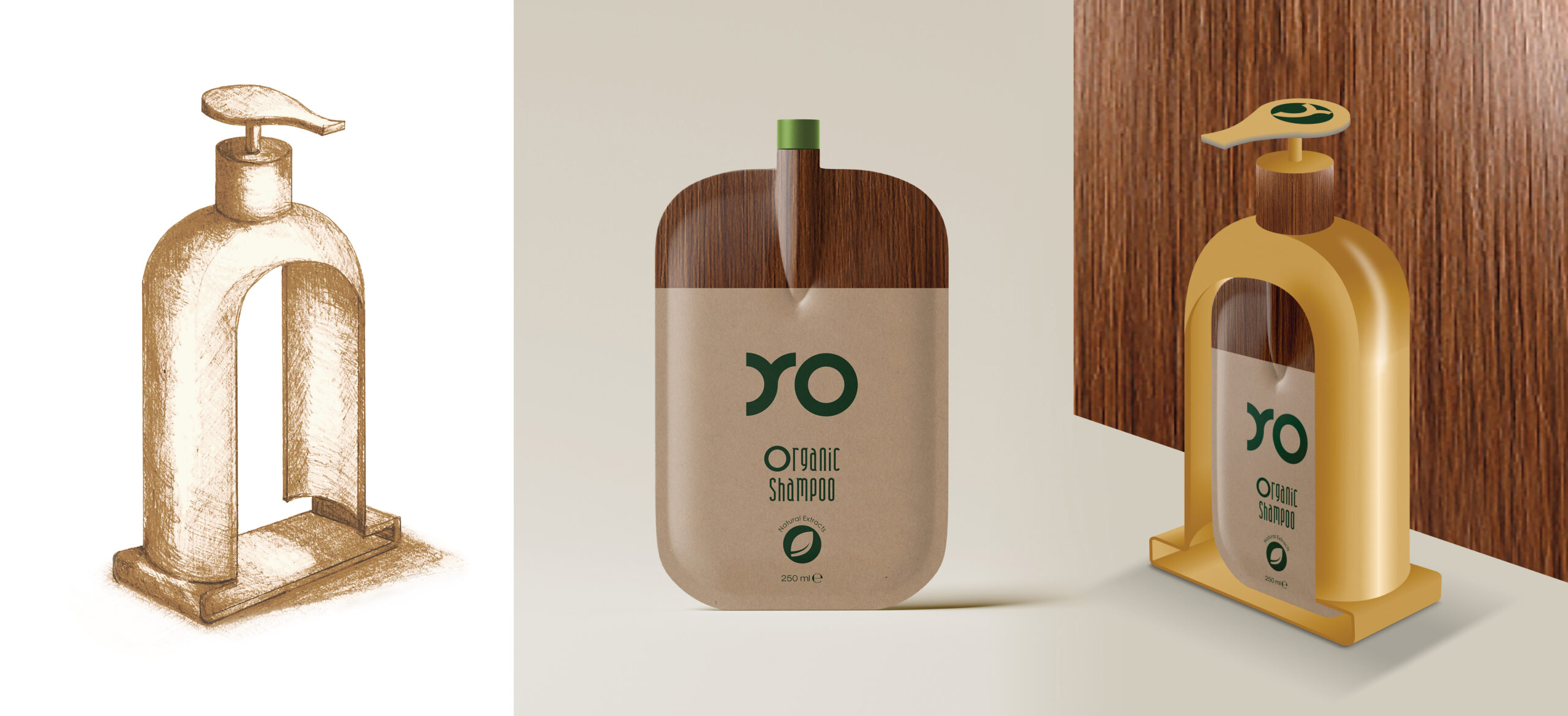
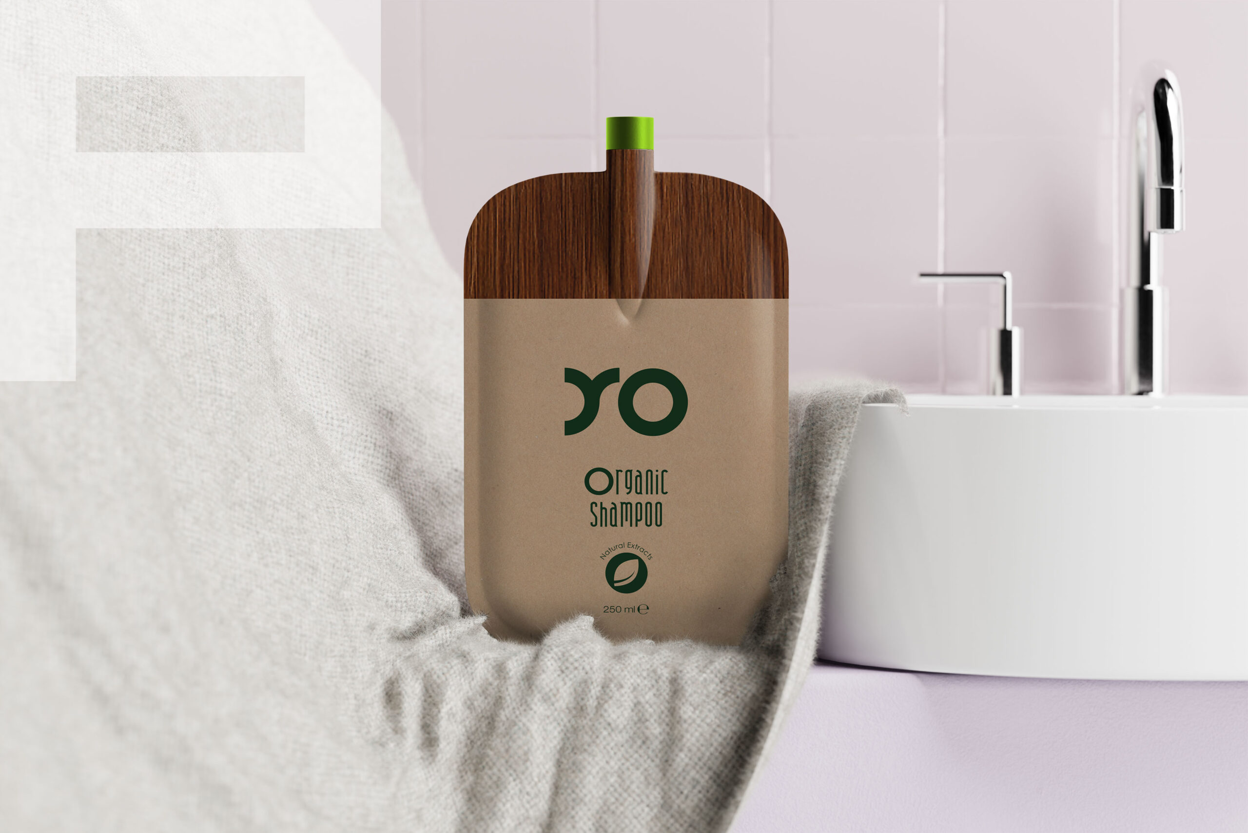
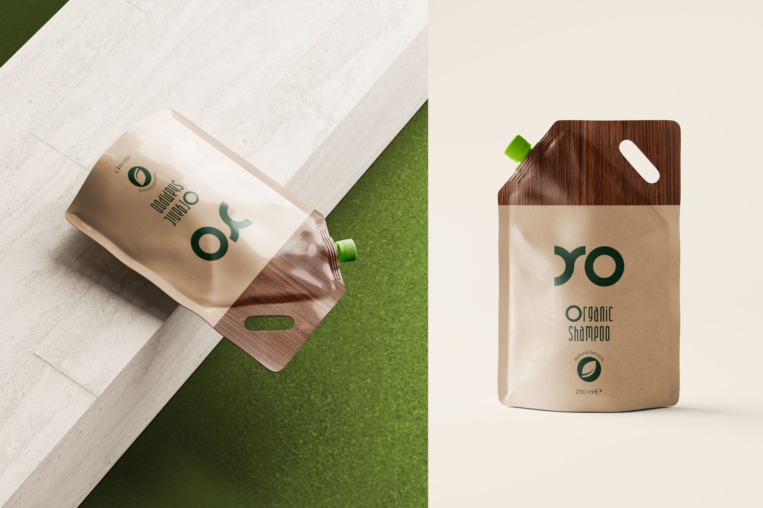
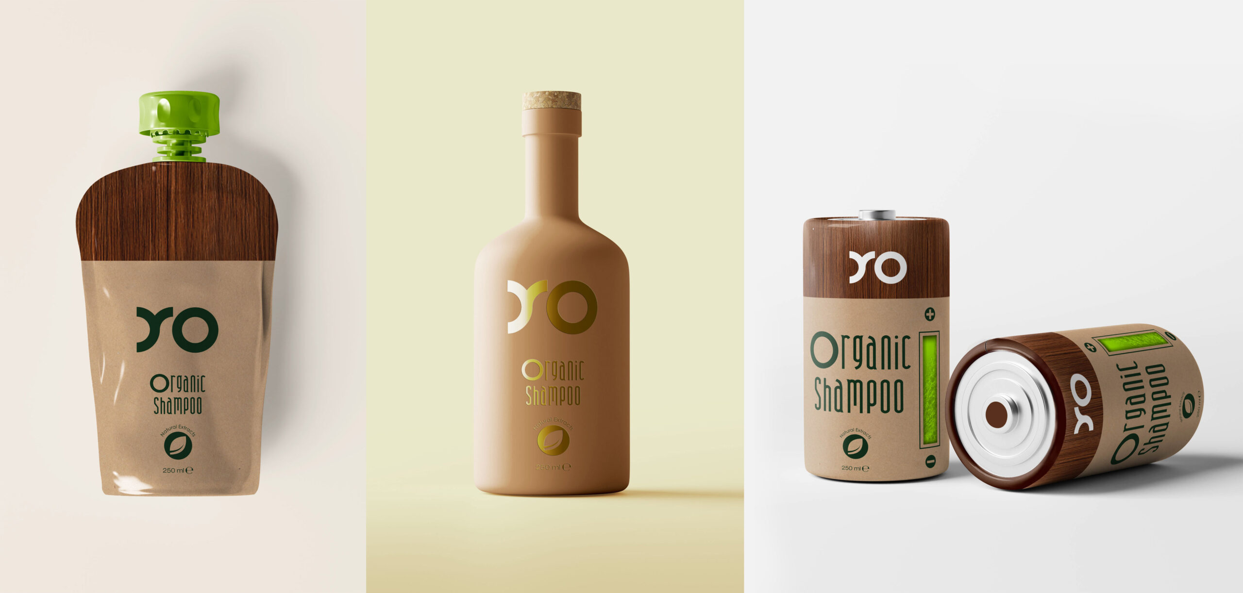
So, we imagined an elegant, on-trend look for a hypothetical shampoo line, packaged in refillable eco friendly containers, made from watertight paper and dressed up with hair pattern. Regarding the naming, we came up with a short name, called YO, having a simple and sleek logo mark, whose curved shapes evoke the curls of the hair. The proposals for dispensers are made from a compostable material of recycled paper and wood.

Project description:
Vision and positioning the brand:
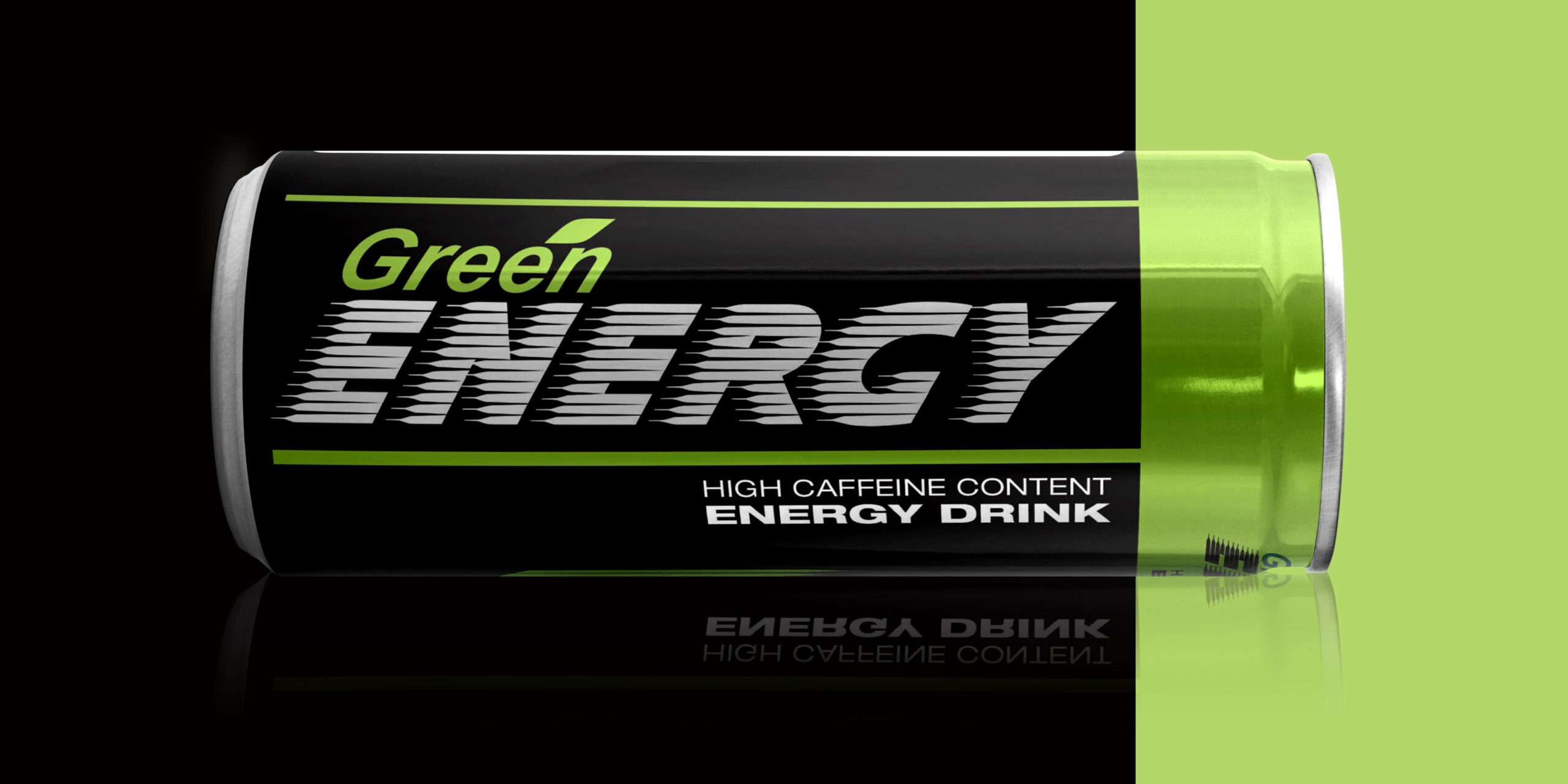
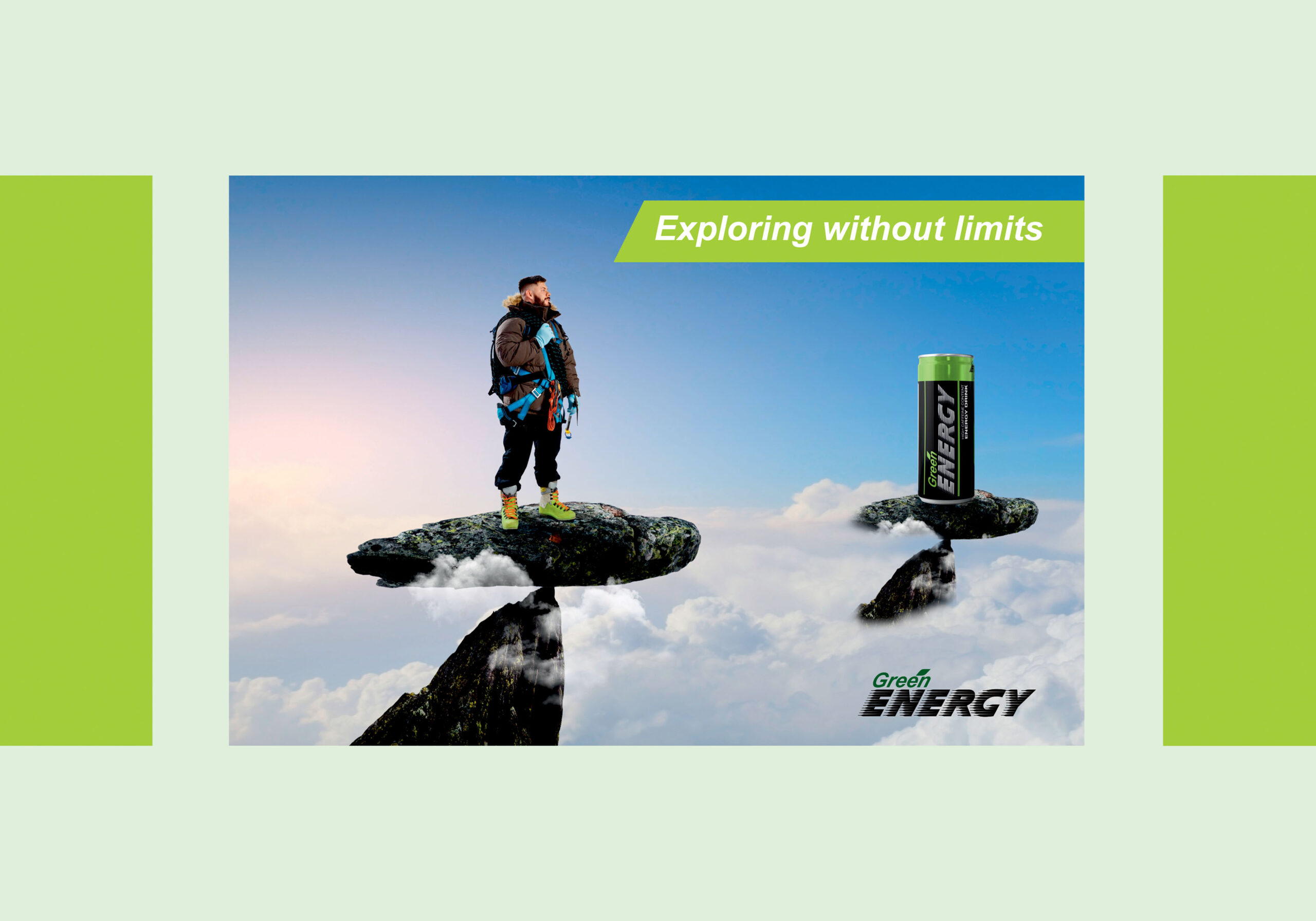
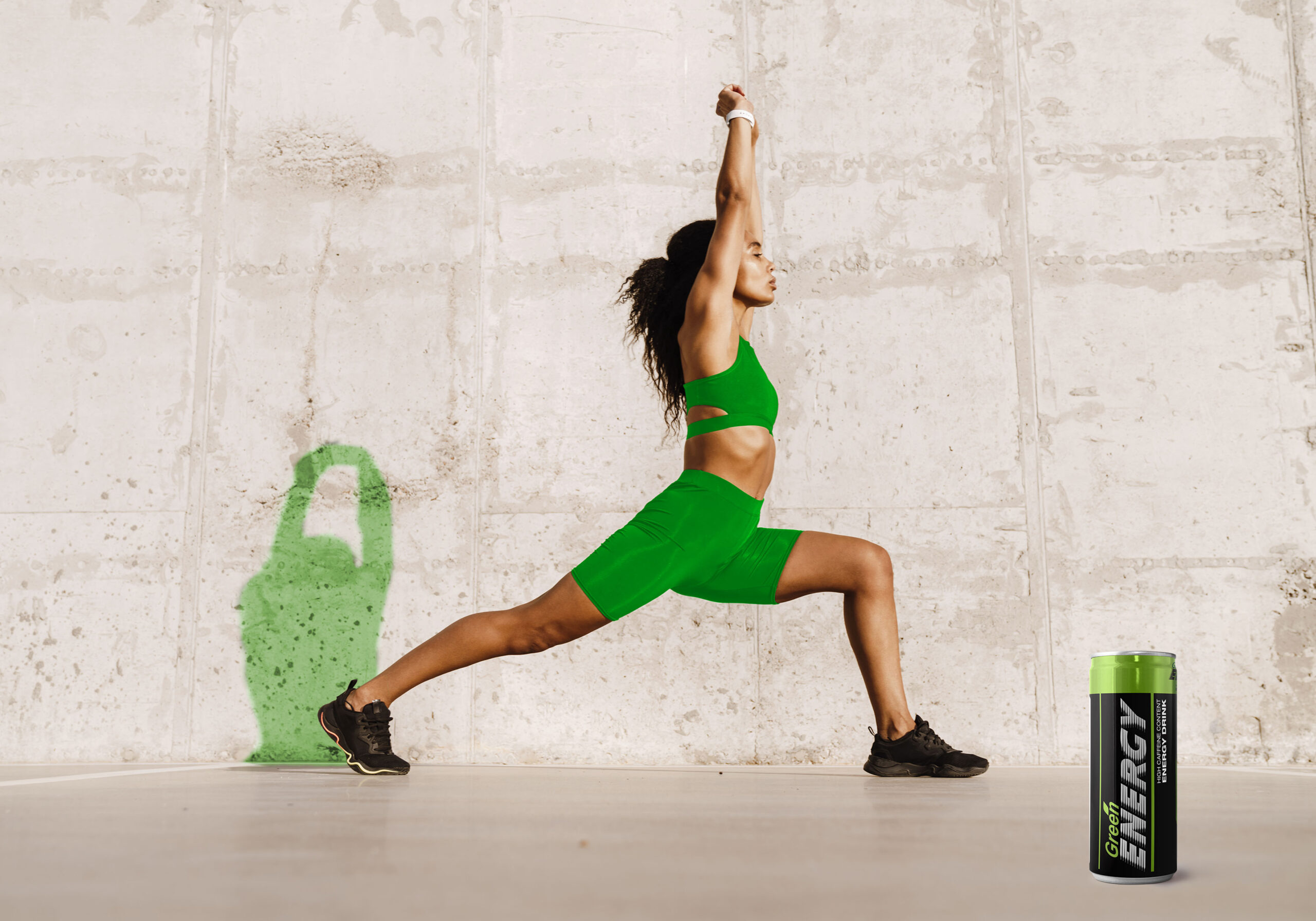
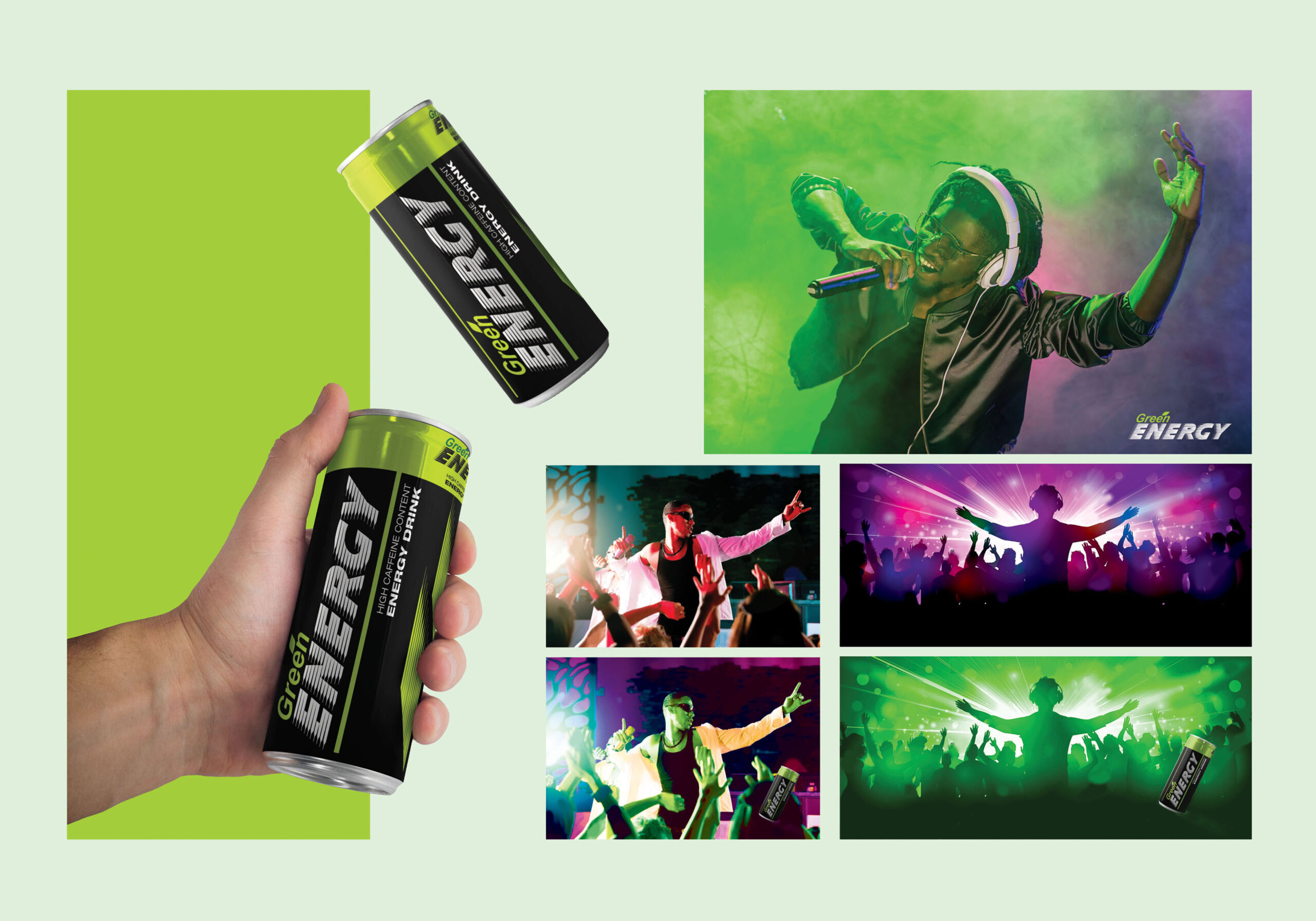
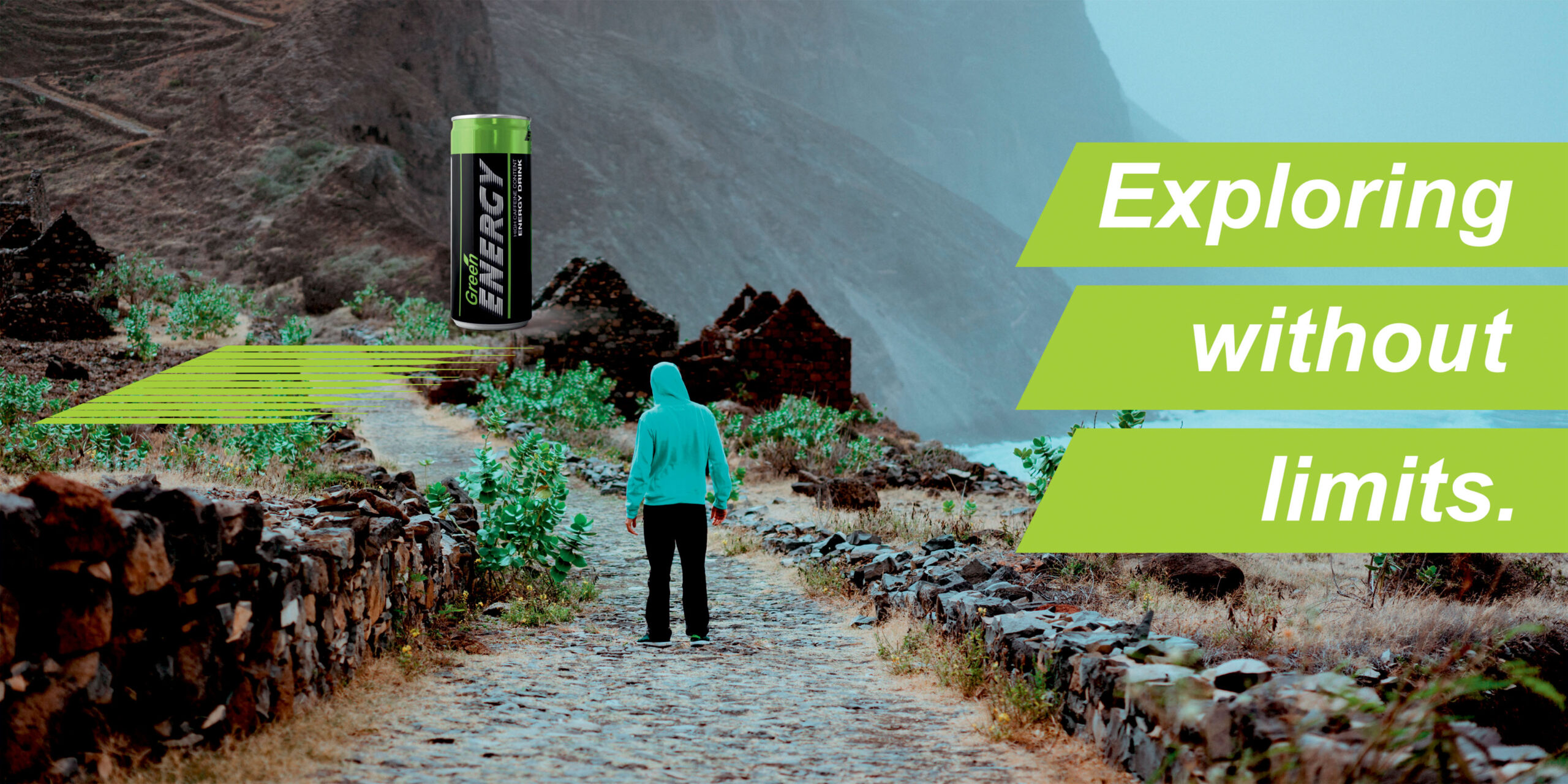
Green Energy – Exploring without limits
Defining the vision: to inspire people
Brand Personality: Strong, Brave
Brand Archetype: the EXPLORER
Keywords: Freedom, Brave, Adventurous, Explore
Target audiance: active young people going to gym,
to parties, clubs, concerts, hiking.
Brand tagline: Exploring without limits